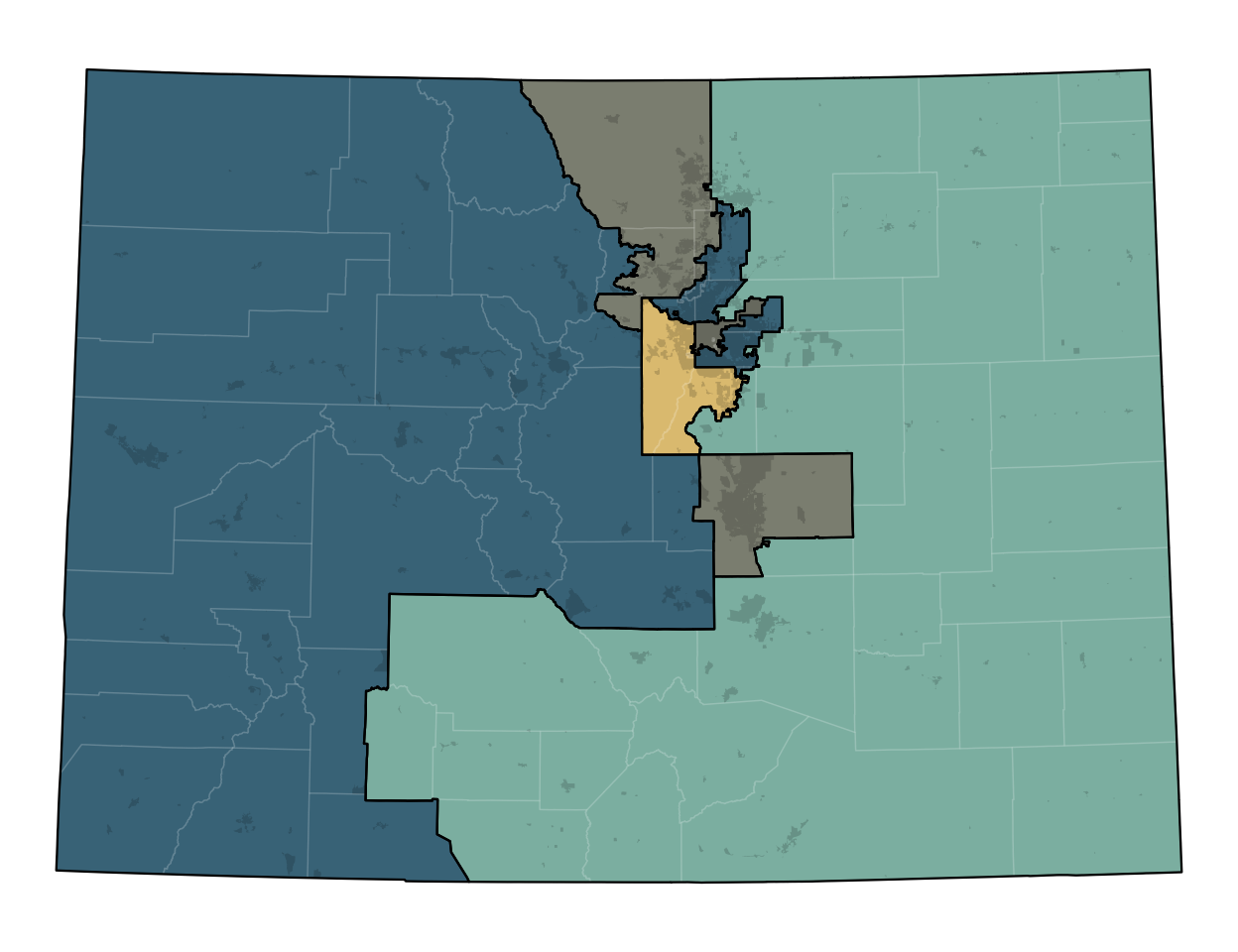
Figure 1: The preliminary congressional districting plan.
On June 23, Colorado’s brand-new independent redistricting commission released a preliminary redistricting plan for the state’s congressional districts. Due to its above-average population growth, Colorado has gained an additional congressional seat since the last time districts were drawn, in 2011.
Already, people on both sides of the aisle are less-than-thrilled with the proposed preliminary plans, citing concerns with district competitiveness. Some have suggested that the plan is slightly biased to favor Republicans, potentially making it easier for them to gain seats and recapture the House.
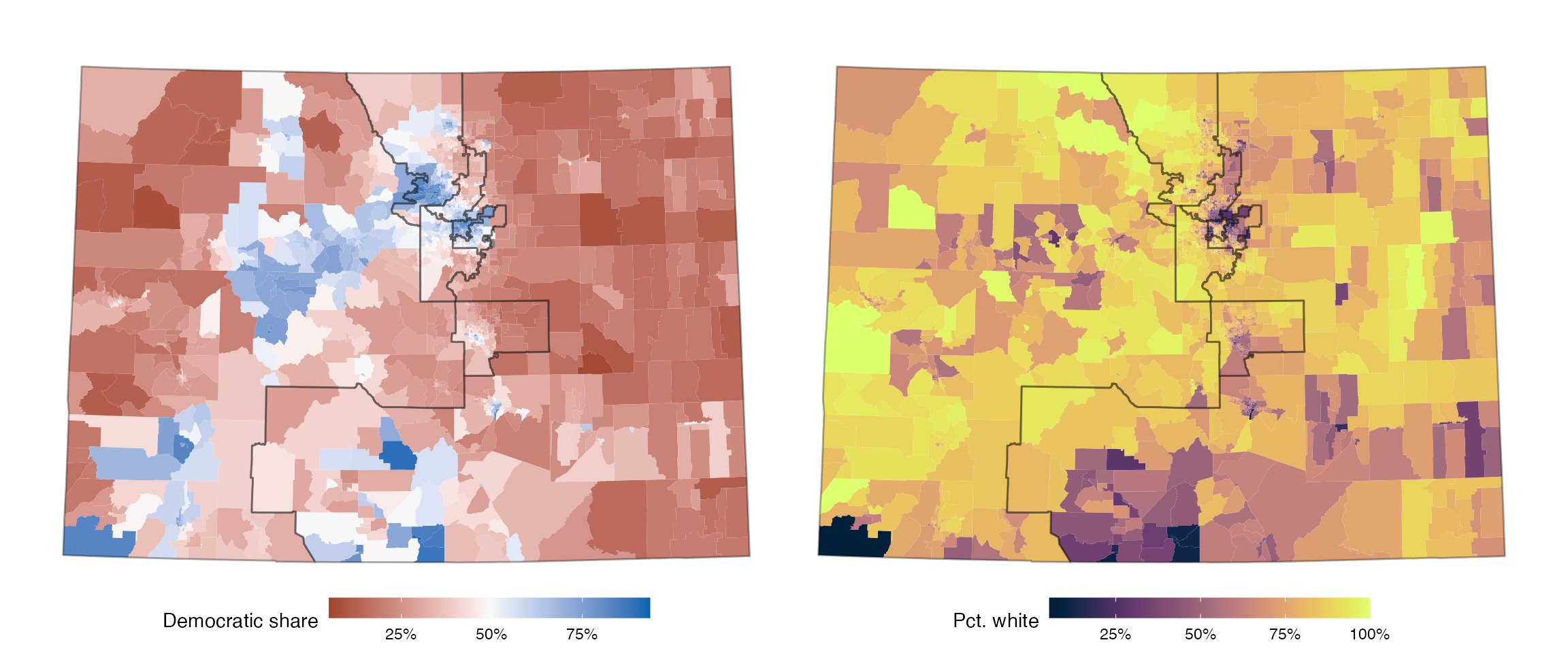
Figure 2: Partisan (2016 election) and demographic patterns in Colorado, with proposed districts overlaid.
But what constitutes a “fair” map in Colorado depends a lot on how different types of voters are distributed, where cities are, and more. What appears at first to be a slightly GOP-friendly plan could in fact be a plan that is good for Democrats, relative to what might otherwise be expected. In other words, to talk about the Colorado plan, it’s important to consider what the alternatives might be.
We’ll evaluate the Colorado plan by comparing it to 3,000 hypothetical other plans, which were drawn by a computer algorithm following the same rules that the independent commission has to follow.
The short evaluation is that, as the title suggests, the plan is generally fair, compared to sampled plans that meet similar criteria.
Generating Plans
Generating 3,000 hypothetical plans is not straightforward—there are vastly more ways to draw redistricting plans than there are atoms in the universe, and yet only a minuscule fraction of these plans satisfy all the relevant legal constraints. Here, we’ll use a new algorithm (McCartan and Imai 2020), which randomly generates plans according to a specific statistical distribution. Reflecting Colorado’s redistricting criteria, we ensure the generated plans:
- Have districts with equal populations (at most 0.1% away from full equality).
- Have geographically contiguous and compact districts.
- Follow county lines as much as possible.
- Don’t use any information on incumbents.
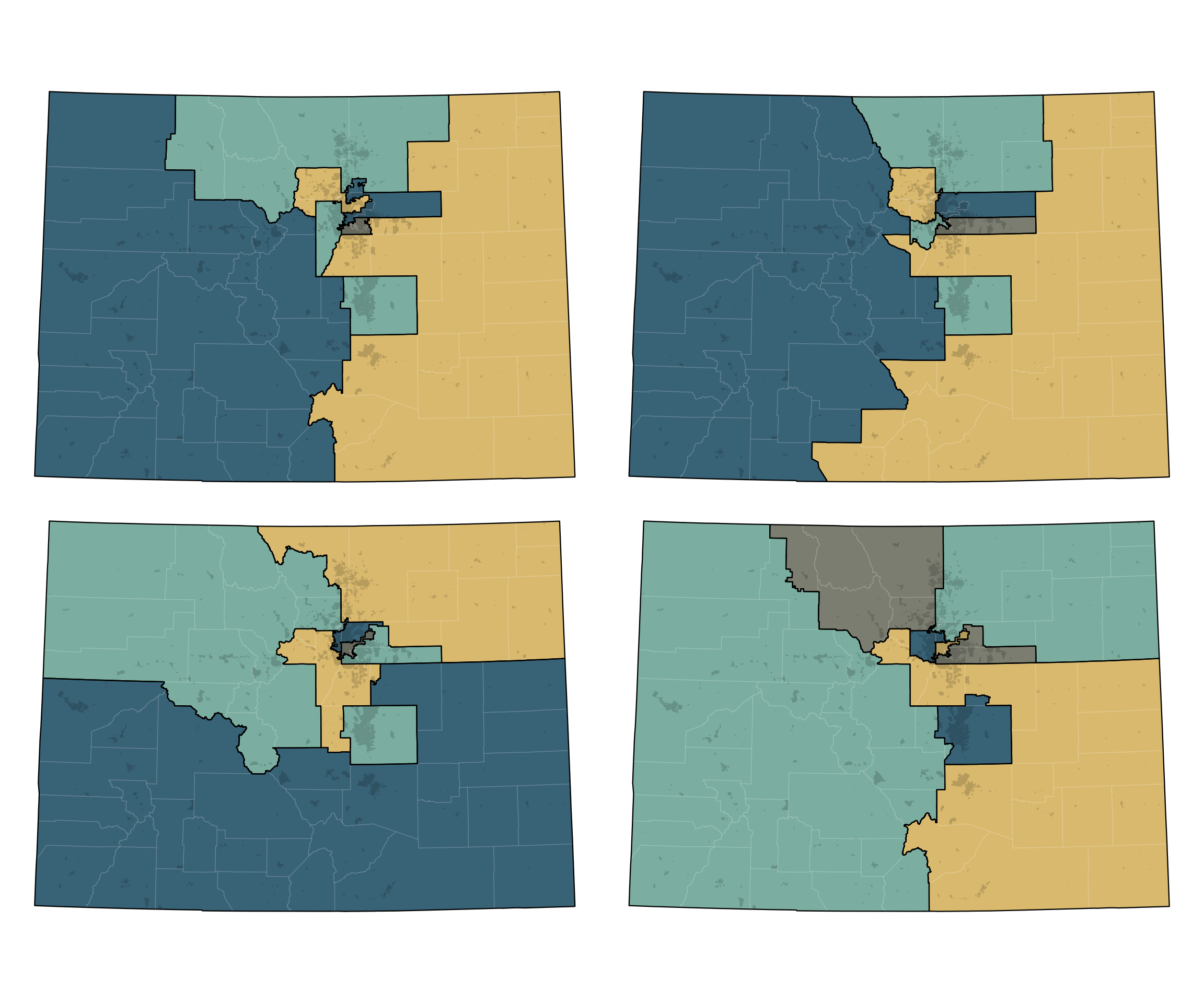
Here are a few of the sampled plans:
Analysis
Once we’ve generated the set of comparison plans, we can use past election data to estimate how congressional elections might have turned out under each of these alternative plans. The results of this calculation are plotted in Figure 3 below, for the 2016 and 2018 elections. Each dot represents a district in a possible plan, with blue dots representing Democratic-controlled districts and red dots Republican-controlled districts, and the districts are arranged by how Democratic they are. The black lines show the estimated election results under the newly-proposed plan. When these lines are lower than their corresponding set of points, that indicates that the proposed district has fewer Democratic voters than would be expected under an average fair and neutral map.
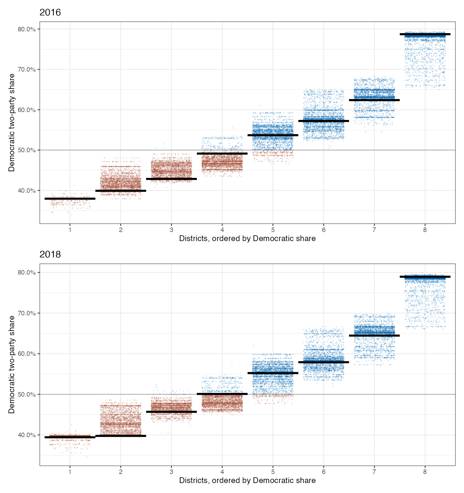
Figure 3: Democratic vote by district for the proposed plan and 3,000 alternative plans.
What we see overall is a proposed set of districts that is very much in line with what would be expected under a fair and neutral procedure. The only consistent difference is a lower number of Democratic voters in two Republican-leaning districts, which is offset by slightly higher number of Democratic voters in the most competitive district. This feature of the plan helps Democrats versus the counterfactual, which would lead to more reliable 4-4 splits.
We also look at what’s called a seats-votes curve, which shows the relationship between the share of votes that a party earns and the number of seats that it wins as a result. Ideally, these two numbers would track each other closely, but gerrymandering distorts this relationship to favor one party. Here, the seats-votes curve for the proposed plan sits looks to be about average for the seats-votes curves of the comparison plans. That is indicative of a map that was drawn without strongly considering one party over the other.
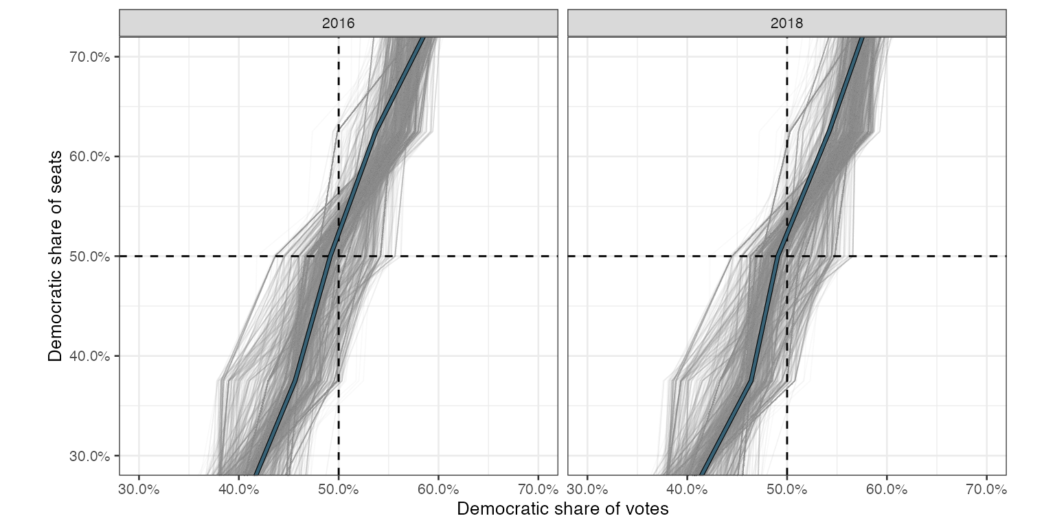
Figure 4: Democratic seats versus votes across two elections. Actual map shown in blue.
Another common way to measure the partisan bias of a plan is the “mean-median difference,” which compares the mean and median districts according to their Democratic vote shares. As the figure below shows, the proposed plan slightly favors Republicans according to this measure, but less than would actually be expected according to the neutral comparison plans. This discrepancy reflects structural bias against Democrats, who tend to cluster in cities where their votes are disproportionately wasted.
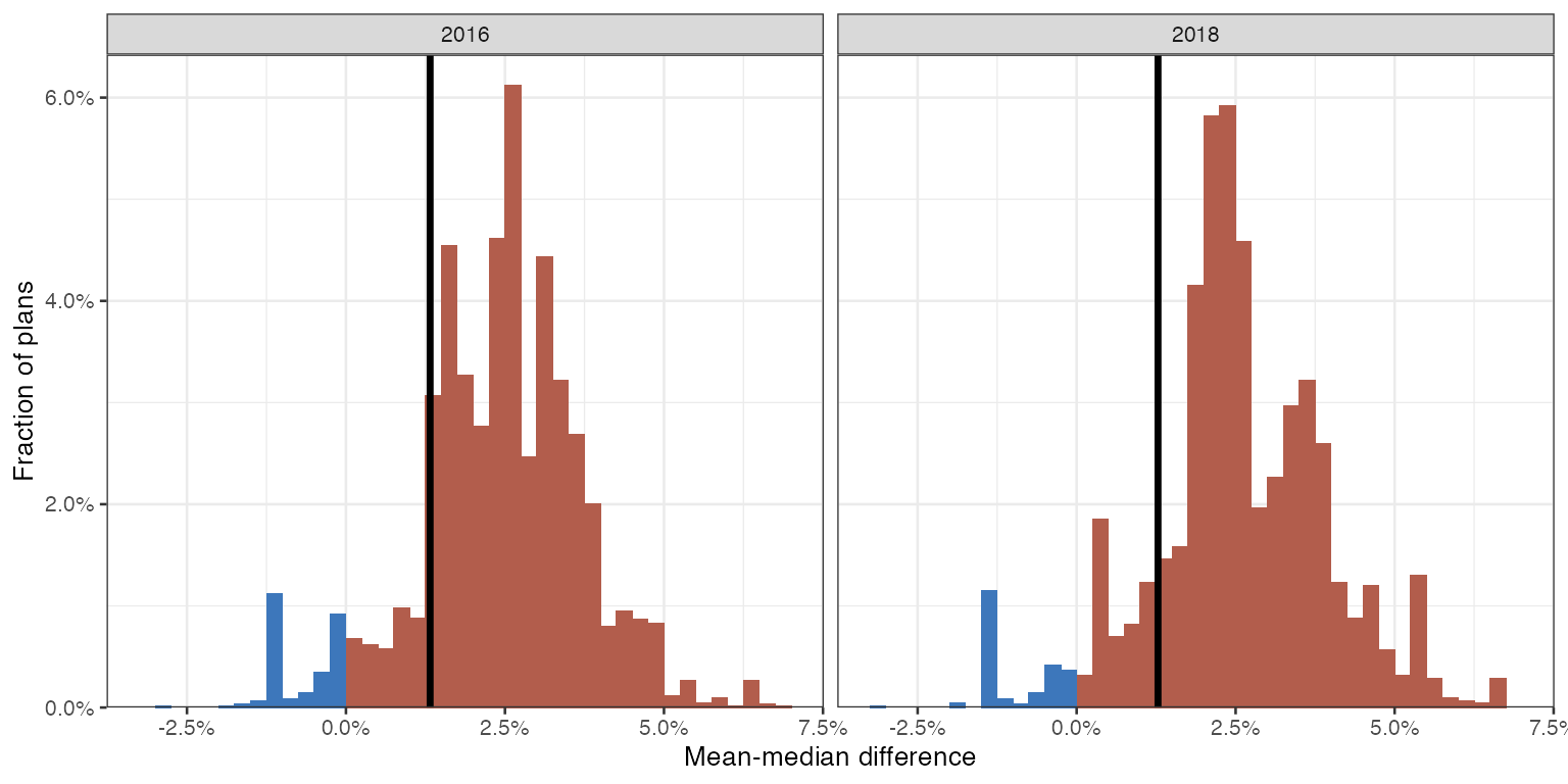
Figure 5: Mean-median bias for the proposed plan and 3,000 alternative plans.
All three partisan bias measures point to the same conclusion: the Commission’s proposed congressional district map is in line with other fair and neutral plans that could have been drawn, and, if anything, slightly favors Democrats.
Data
Since the Commission provides population estimates at the 2010 block level, we start by building a block dataset using geomander (Kenny 2021). This has the shapes for each block along with the population and voting age populations by block.
Generally, we use a different definition of populations from what Colorado provides. We often treat race and ethnicity as one variable. However, Colorado’s preliminary data follows the Census Bureau’s choice of treating race separately from ethnicity. This means that Hispanic is separated from the standard race categories. Additionally, the preliminary estimates do not include voting age population. As such, we build additional data using the blockpop package (McCartan 2021), which uses the FCC’s yearly block estimates of populations to estimate the 2020 population at the block level. This is fairly consistent and provides cleaner categories for 2020, but differs slightly from Colorado’s choice of population estimates.
As for election data, we rely on the precinct data from the Voting and Election Science Team, who produce some of the best redistricting data available. We average the Republican votes and Democratic votes across offices for 2016 by precinct across president and senate races (Voting and Team 2018). We do the same across the elections for Governor, Attorney General, and Secretary of State elections in 2018 (Voting and Team 2019). To match the demographic data, we project this data down to blocks, splitting it by the proportion of voting age population in each precinct.
With all of this data estimated at the 2010 Census block level, we aggregate to 2020 voting districts. Using the 2020 Census’s shapefiles, we can then approximate the redistricting process in Colorado. This gives us 3108 geographic units, which average 1,618 people per voting district under the 2010 data, 1860 people under the data from blockpop, and 1858 under the preliminary data from Colorado.
Finally, Colorado provides the district shapefiles, but doesn’t provide a block assignment file (BAF), which would match blocks to districts directly. Without this, we match blocks to districts by the area overlap of each voting district with the districts. Matching by area is imperfect, but this gives us a good starting point to consider the preliminary plan on 2020 geographies.